UX/UI Case Study
About the project:
Court Link, a conferencing app for court mandated counseling, provides on-the-go accessibility. Users can fulfill program requirements, gaining freedom from court obligations and fostering a mentally healthy perspective.

Court Link
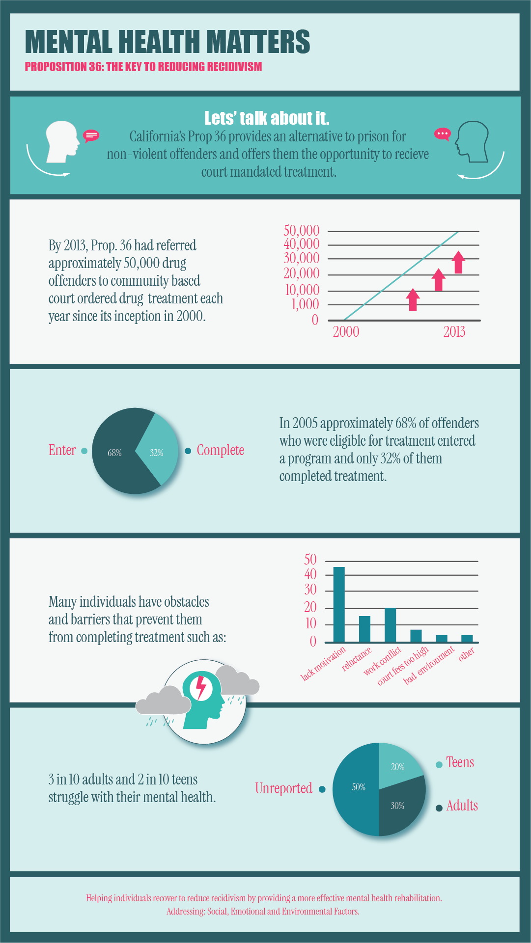
The challenge of accessing mental health services mandated by a court. Individuals encounter difficulties in meeting the required attendance obligations due to various factors including motivation, transportation, reluctance, no family support and an overall lack of a structured environment.
The Problem:
The Solution:
An application that leverages technology by providing engagement on the go. With the convenience of in-app scheduling, users may manage counseling around their personal lives. The design is aimed at ensuring a clean and distraction free user experience for a more accessible and user friendly approach to mental health interventions.
My Role:
I researched data and conducted interviews, developed personas and user task flows, sketched initial ideas. I then created wireframes, established a style guide, conducted usability tests and iterated on designs to produce a final product.
Discovery/Research
I focused on the subject matter by researching secondary data. Using this quantified data, I validated the necessity and potential success of the proposed application. This approach enhances credibility and provides a broader perspective on the topic.
Quantitative Analysis:
I conducted a survey of 18 people, aged 22 to 54, to identify individuals with experience with the State Department of Family Services or Parole and Probation for follow-up interviews. In-person interviews revealed recurring behaviors and emotions, which helped refine my user persona for a more accurate representation of the target audience.
Qualitative Analysis:
After reviewing user feedback and personally testing Google Meet, MS Teams, and Zoom, I found that while users appreciate their features, many struggle with complexity, navigation, and overall usability. Simplifying the interface and removing unnecessary features would better meet user needs, help reduce confusion, and encourage participation.
Competitor Analysis:
Define
Joseph Miller, 25, was recently released from a correctional facility and is unemployed. Court-mandated counseling and job-seeking requirements, combined with his criminal record, create stress and exacerbate mental health struggles. He finds navigating court obligations and job applications overwhelming and discouraging.
Target persona:

“This is a waste of time, I don’t need counseling.”
staying motivated
no family support
lacks resources
negative environment
no stability with housing
Obstacles:
manage anxiety
create a work life balance
manage his emotions
manage his stress
obtain employment
Goals:
Teens aging out of foster care often face mental health challenges that impact their well-being and increase the risk of delinquency, unintended pregnancies, and abusive relationships. Similarly, parents trying to regain custody may relapse without access to mental health care and family support.
To address these issues, I asked: “How might virtual services reduce attendance barriers and improve outcomes through increased participation?” Since most users attend involuntarily, the goal is to simplify access to counseling services in line with court program objectives—without overwhelming or discouraging engagement. Interviews revealed recurring user constraints, including:
Individuals released from correctional facilities often stay on track with the structure of Halfway House programs. However, without ongoing support, many face mental health challenges and employment instability—barriers that can lead to relapse and reoffending.
Defining the Problem:
External factors:
The commute to and from
Length of meetings
Frequency of meetings
Associated fees too high
Child care not available
Emotional factors:
Lack of motivation
Unwillingness to participate
Discouraging atmosphere
Negative outlook on results
Distractions
Ideation
To better understand user’s needs and create an effective solution, I prioritized aspects from my user stories to identify key user tasks and brainstorm potential ideas. These insights helped shape the initial design flows, highlighting the main tasks that are further explored in the sketches below.
The success of this application will be defined by a reduction in attendance barriers, increased engagement, improved efficiency and accessibility of the courts rehabilitation programs. In addition to users engaging the duration of counseling necessary to enact meaningful changes in their everyday lives.
Sign up
Join a meeting
Reschedule or cancel a meeting
User Tasks:
Create a simple sign up process
One step JOIN from Home Screen
Calendar access from Home Screen
Brainstorm Ideas:
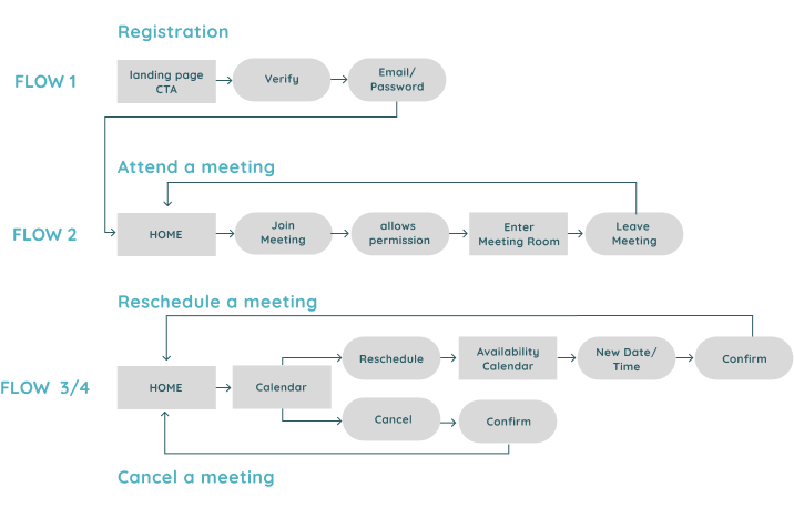
I proceeded to create rough sketches for each task flow using ideas from brainstorming. The flow process involved: A mobile verification sent to the user as an email link to download the application. As a layer of security, all personal information would be pre-filled by the referred agency leaving the user with simply the task of creating a password. Keeping all main tasks (join meet) visible from the Home Screen. A Calendar displaying a users next meeting and the ability to cancel or reschedule.
Sketches:

Sign Up Flow #1
*Download app/verification code sent as email link.
*Personal info prefilled, create password task.

Join Meeting Flow #2
*All main tasks visible on Home Screen

Scheduling Flow #3
* Calendar to cancel or reschedule
I conducted initial usability tests using the paper prototypes. By having users think out loud I was able to determine what changes I could make to improve the design. A few edits were made before advancing to the next stage.
I identified the key tasks and prioritized the user flows leading to a Minimum Viable Product - a simplified version of the application that remained highly usable, even in its simplest form. This approach also established a foundation for future development including the integration with court systems to oversee progress and enhance communication between agencies.
User Flows:
Design
The sign up flow remained the same. The most noticeable is in the structure of the Home Screen where I removed actions from the center of the screen into a bottom navigation bar. I noticed that users had to browse the screen for the JOIN button even though it was also on the home screen, I decided to move its placement to center screen. Additionally I noticed that even though the bottom navigation showed a calendar button, users thought that they needed to tap on the calendar icon to reschedule. I conducted a second round of usability tests with the wireframes to determine if: The process flowed in a logical way, to assess if the users could navigate through the tasks, and to determine if any UI elements were distracting or difficult to find.
Wireframes:
*A call to action button to download the app. * Verification code sent to email. *Create password task.
Sign Up Flow #1

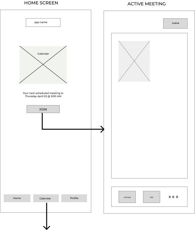
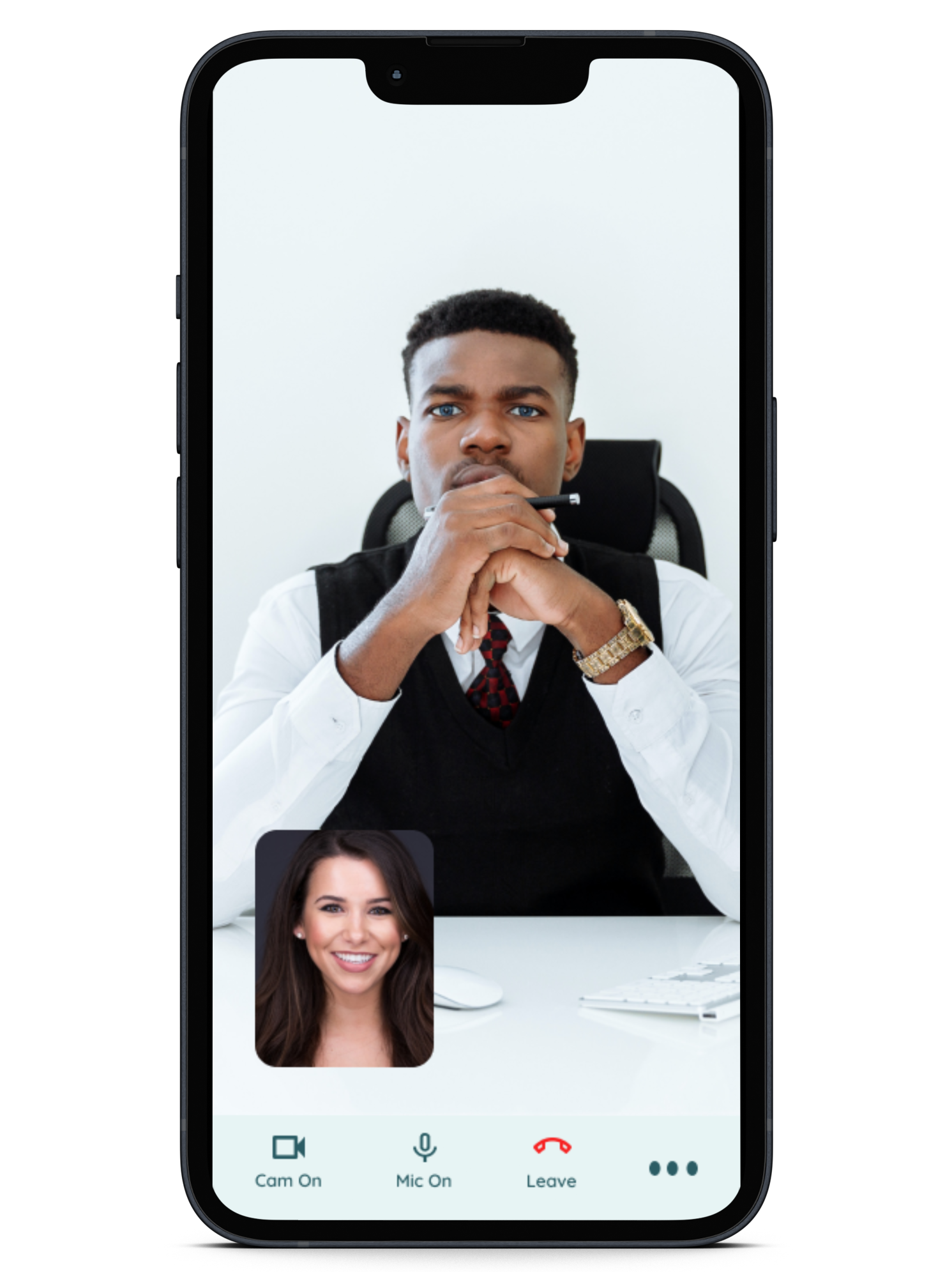
*One step join from Home Screen. * Created bottom navigation bar. *Main tasks visible from Home Screen.
Join Meeting Flow #2
Scheduling Flow #3
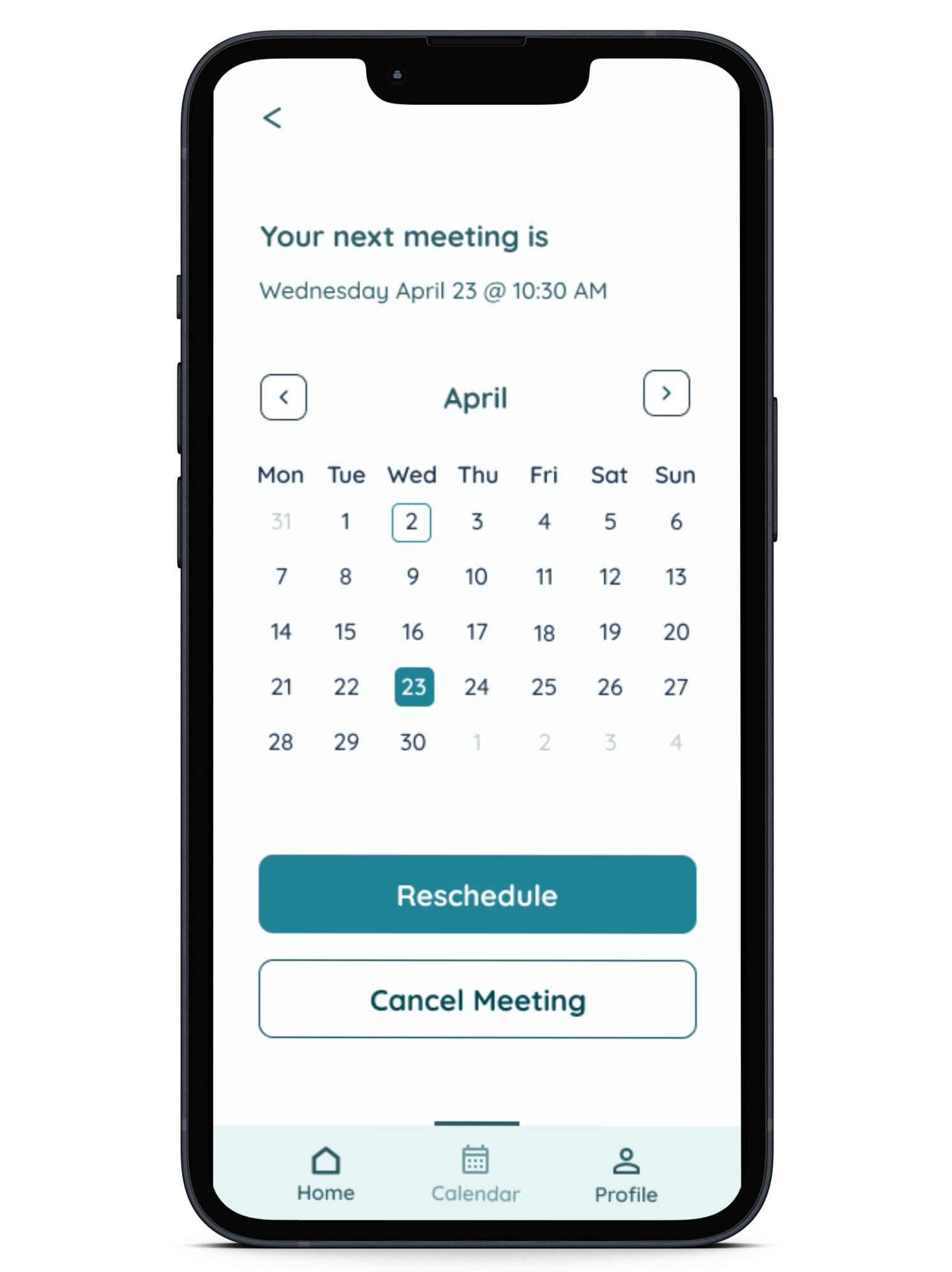
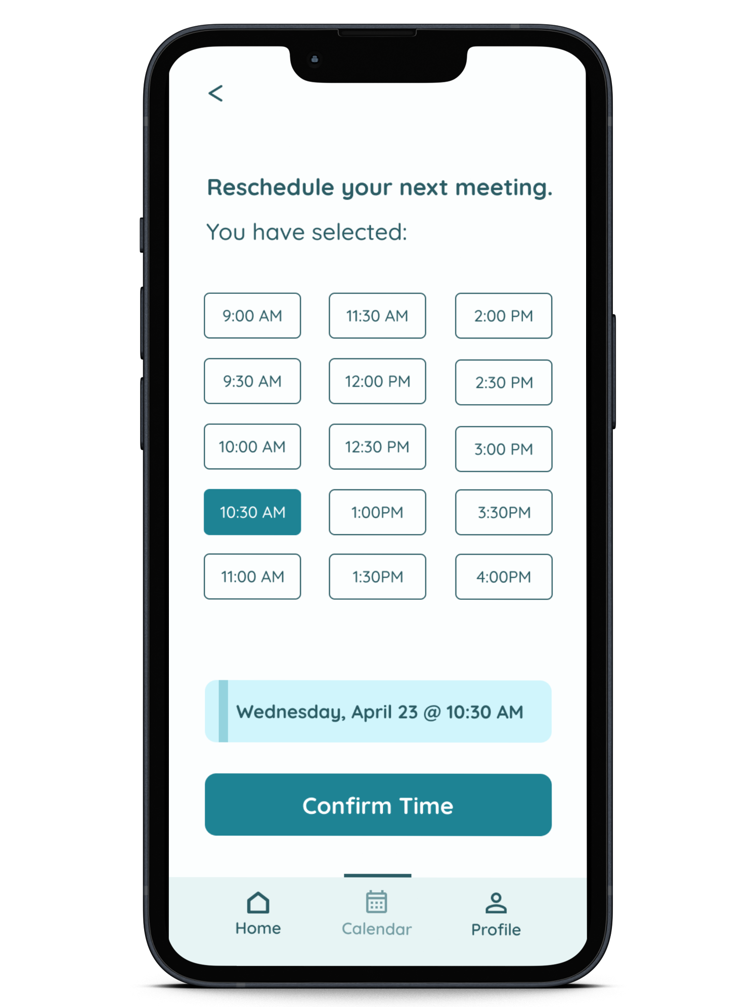
*Next meeting displayed on scheduling screen. *Calendar date/time selections. *Confirmation screen.

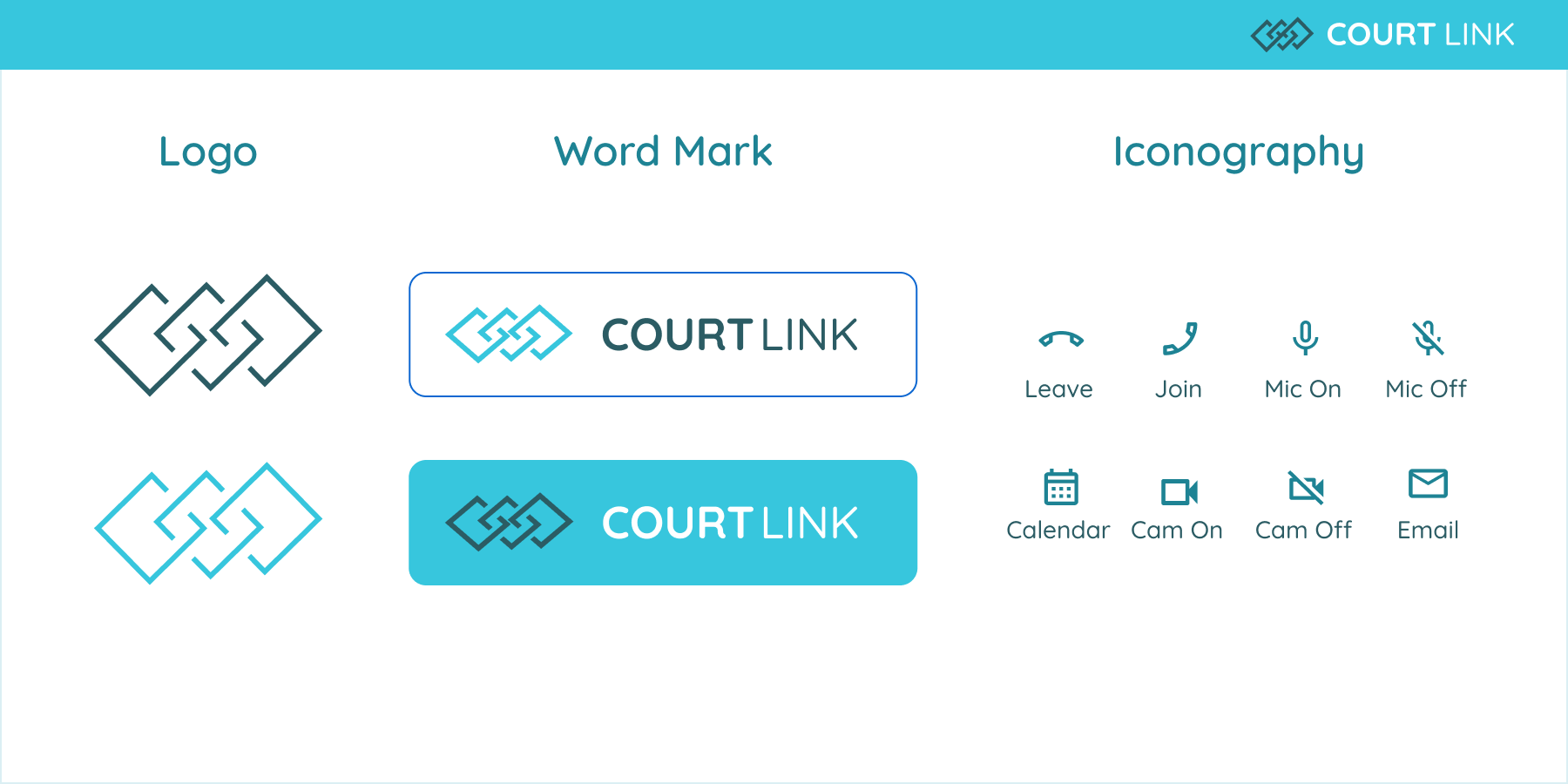
Blue/teal palette: chosen for its natural association with the sky and ocean, evoking trust, calm, and clarity.
Typography: Quicksand – a clean, minimalist sans-serif font with an approachable and modern feel.
Line icons: for simplicity and clarity, styled with an accent color from the palette to maintain consistency
Court Link logo: features three open, intersecting squares —representing the app’s purpose of linking users to court services.
At this stage, I determined the colors and imagery that would evoke the intended user emotion and developed the brand platform.
Style Guide:


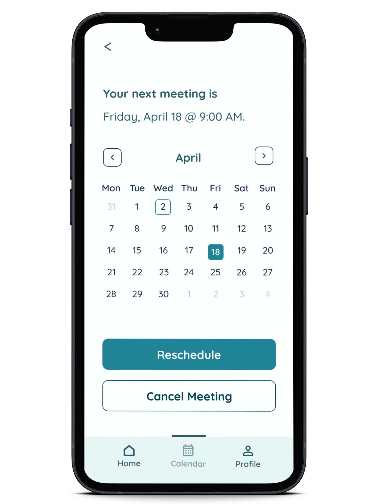
I decided to eliminate the initial displayed calendar from the Home screen, opting instead to make the calendar visible for date selection only when a decision is made to reschedule a meeting, also with the idea that it would reduce visual clutter. I determined that the JOIN action would benefit by making it prominently visible as it is the main call to action. I proceeded to create a high-fidelity clickable prototype of each of the task flows to perform a third round of usability testing after implementing changes to a few of the main screens.
Hi-fi Prototype:
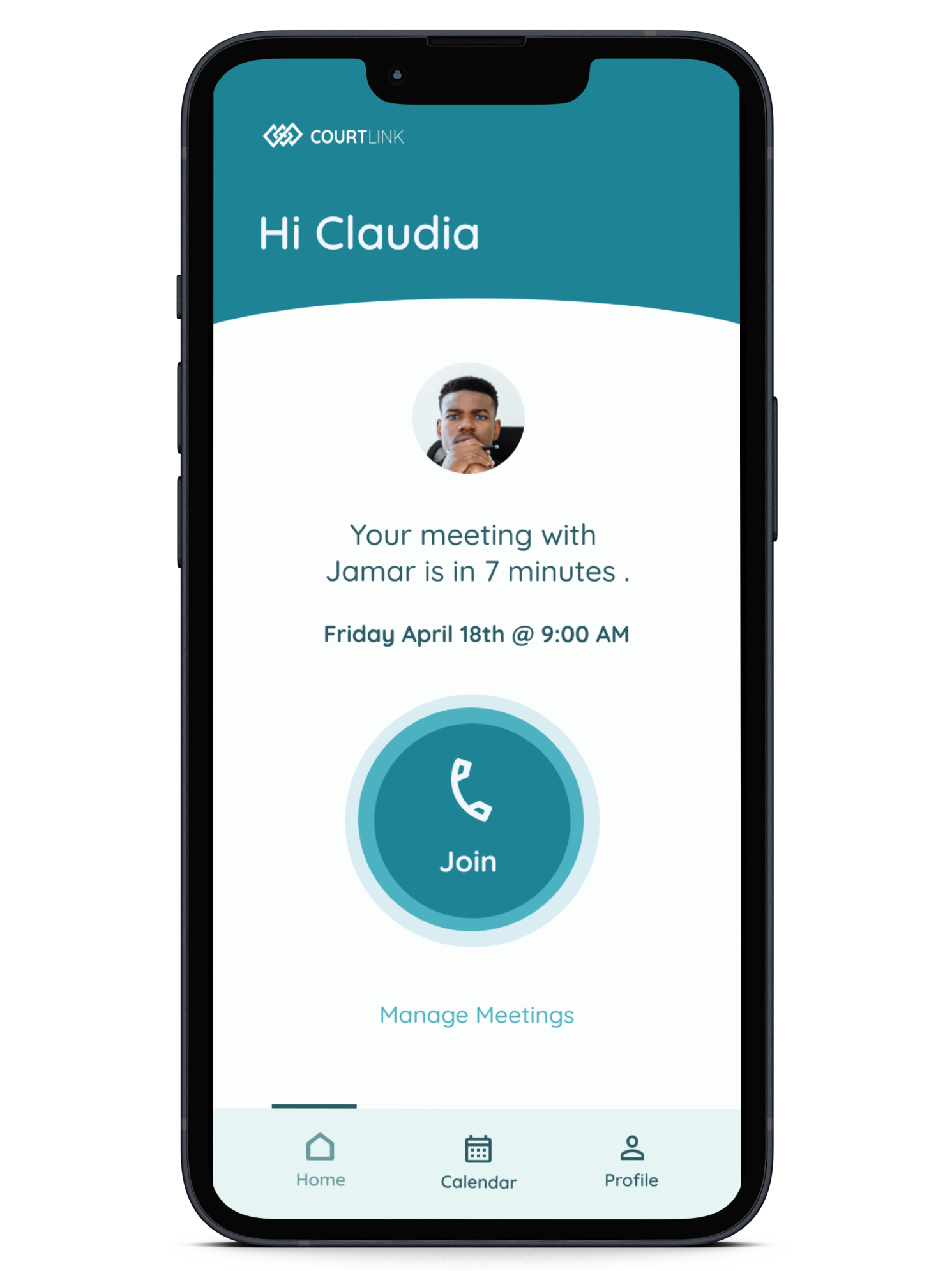
A splash screen with a call to action to DOWNLOAD app. Social media login options for return users one-step login. When entering the app, users are greeted by name to acknowledge the user and foster a connection. A text display of the upcoming session on the Home Screen. A large centered call to action for one step JOIN option. The changes made were positive, users were able to navigate through the screens to complete all tasks.




As a beginning designer, I initially brainstormed numerous features for my project, only to discover that adding a button to a screen doesn’t guarantee functionality or purpose. I’ve learned to design with a focus on the intended function. I've also come to understand that an excess of elements not only creates confusion but can also lead to an overwhelming experience. I've embraced the notion that sometimes, simplicity and a less-is-more approach lead to a more effective and user-friendly design.