Audio Verse is a popular music media streaming app. At the moment, its freemium features are rather fundamental. The freemium version has now gained significant traction and the clients aim is to enhance user engagement and create revenue by introducing a premium paid subscription.
UX UI Case Study
About the project:
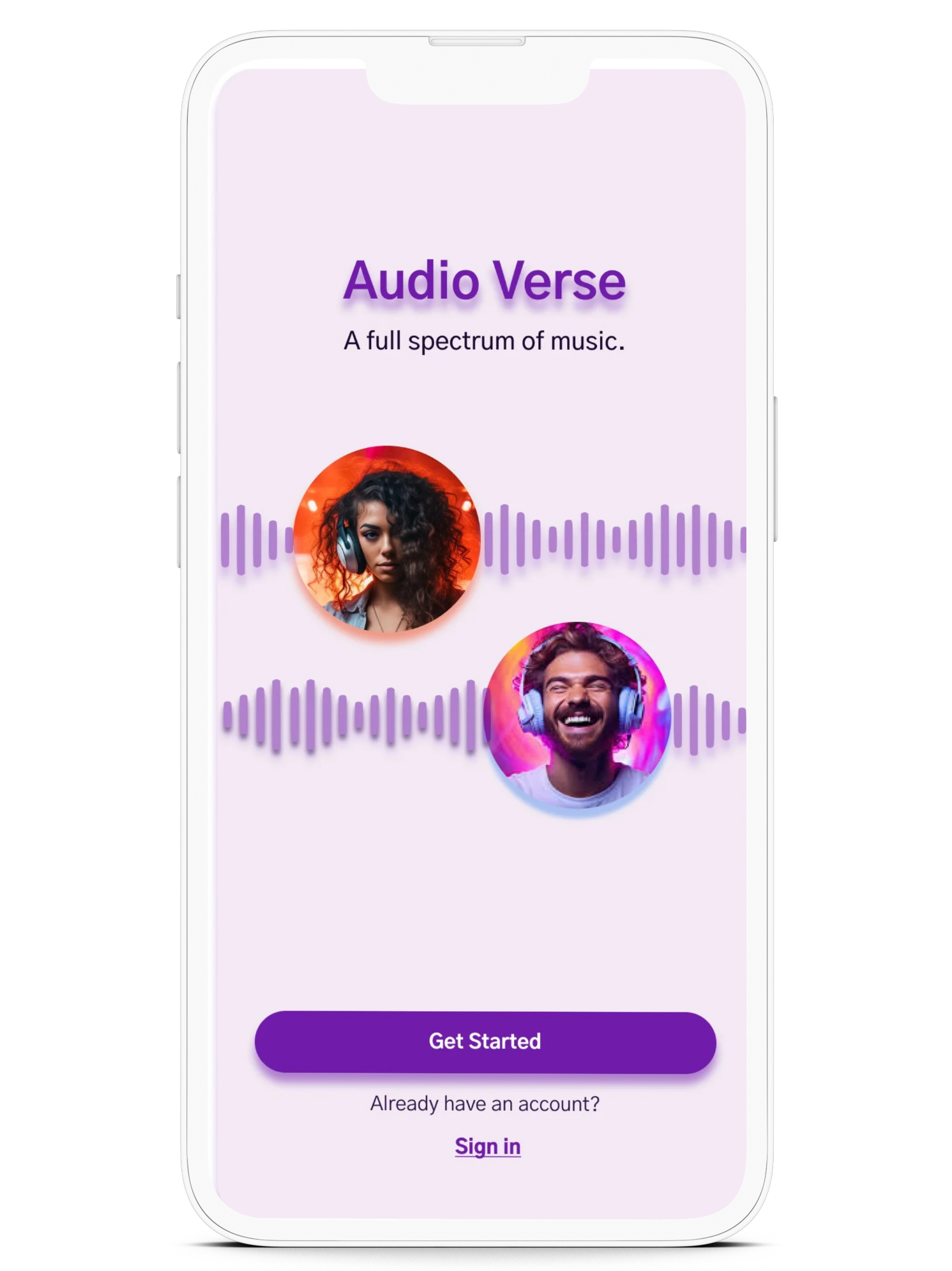

Audio Verse
Streaming with Custom Subscription
The integration of a Menu allowing new users to subscribe to the Premium Plan during the initial account creation. The incentive of a Free Trial period to encourage new subscriptions, the flexibility to create a custom plan allowing users to only pay for features they use and a new Call-to-Action prompting returning guest users to upgrade from the free version. Additionally, hesitant users have the convenience of opting out of entering payment details during sign-up.
The problem:
The apps current registration procedure lacks a distinct prompt for users to subscribe to the new Premium version upon sign-up and does not effectively encourage upgrades within the free version. The lack of a compelling incentive to upgrade impedes the conversion of both new users and returning guests into paid subscribers thereby restricting the app's ability to generate revenue.
The solution:
In this project, the client provided the overarching problem and goal, while I was responsible for conceptualizing design aesthetics and executing the user flow, wireframes, prototypes, and final screens. My role involved taking the client's vision and translating it into a cohesive and intuitive design solution that addressed their needs.
My role:
Discovery/Research
I examined industry leaders Pandora and Spotify to identify effective strategies and elements misaligned with the client's goals. I also analyzed customer reviews to pinpoint both acknowledged and unmet preferences related to features, services and prices.
Competitive
After in-person interviews I utilized empathy mapping in the ideation process enabling the development of solutions that effectively addressed user concerns. By understanding their thought processes and identifying common pain points it became clear that users were concerned about whether the fee justified the available features, with their deciding factor being the perceived value of those features.
Interviews

USERS EMPATHY MAP
Define
The project's goal is to enhance user conversion for the Audio Verse Music Media App. Existing challenges in sign-up and upgrade flows call for a more engaging user experience. Through user interviews and competitive analysis, specific pain points aligning with the client's objectives are identified, establishing a crucial foundation for a design that ensures purposeful solutions that directly address the identified challenges.
The goal:
The idea was to enhance the user flow by incorporating a dedicated landing page within the existing sign-up process. This page would showcase the premium and customized plans with prices with the option to subscribe to either plan seamlessly during registration or to opt out and continue as a guest allowing the user to first browse before making the paid commitment. Additionally guests users would be provided the opportunity to upgrade their plan with a clear Call-to-Action from the guest home screen.
Brainstorm:
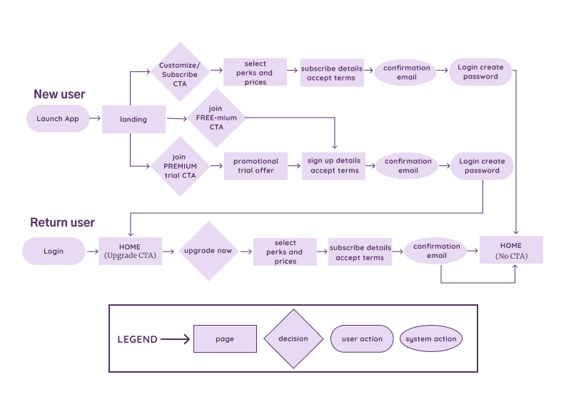
UPGRADED USER FLOWS
Design Ideation
When creating the wireframes, the goal was to visually convey the refined flows designed to meet the specific needs as outlined by the client. These wireframes served as the foundation in designing the app’s crucial screens, capturing the essential features necessary to represent the app's interface and intended functionality. Below are the wireframes, with an image of the initial screen before changes and then the same screen after.
Wireframes:
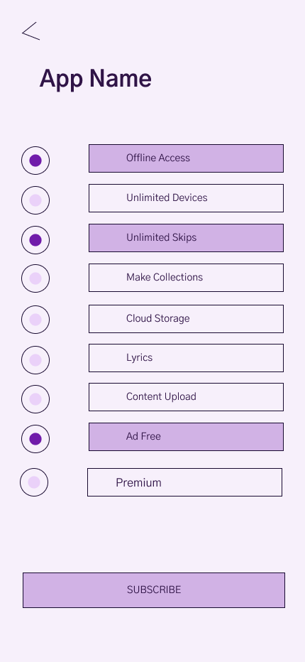
The original screen design required selecting each plan individually to view details, causing back-and-forth navigation for comparison.
Subscription Screens
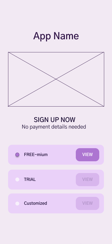

The updated screen design presents all of the plans along with the fees on a single page for easy comparison.
The original screen design listed services without clear fees, leaving users unsure if a more cost effective option exists with a competitor.
Custom Selection Screens
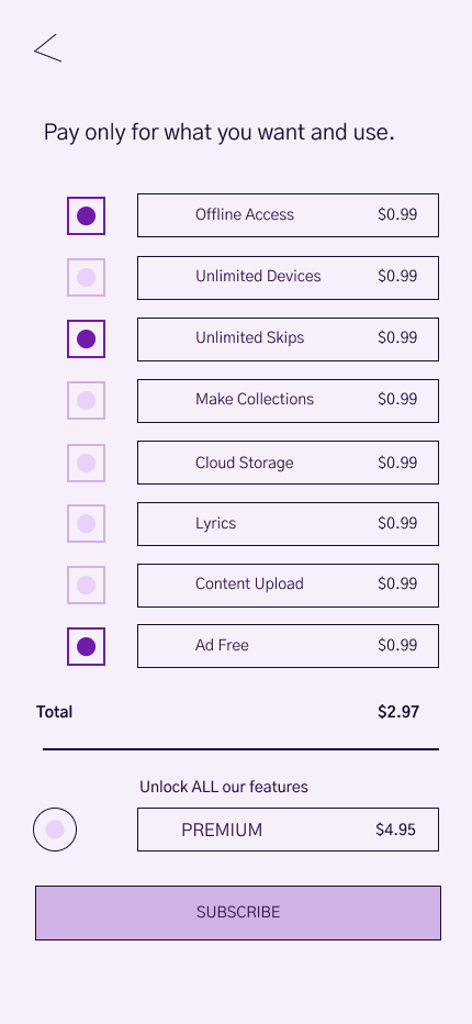
The updated screen design displays associated fees allowing users to compare the cost effectiveness between the individual services and premium plan.
The original screen design was a basic overlay confirming account creation but lacked subscription details.
Confirmation Screen

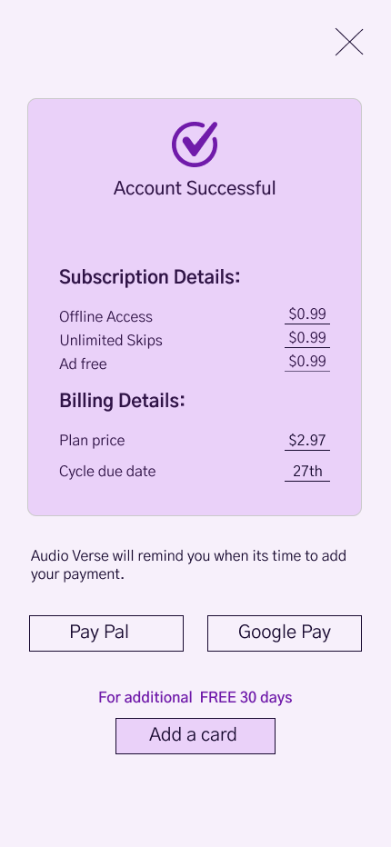
The updated screen design confirms account, summarizes subscription details and offers a payment option.
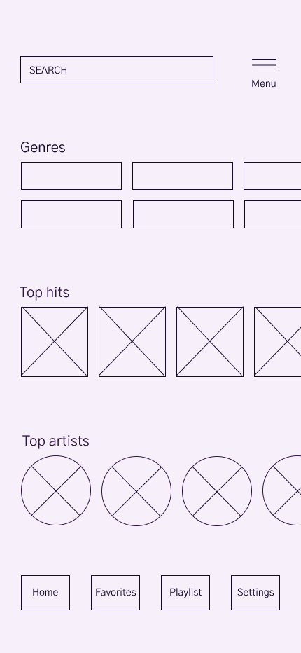
The original screen had a CTA that did not stand out lowering the chances of choosing the premium option.
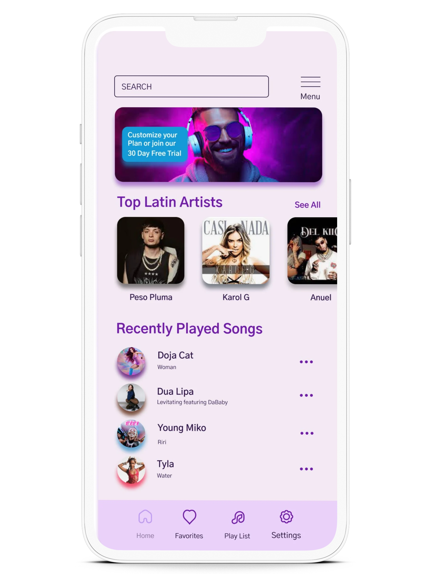
Home Screen

The updated screen has prominent Call to Action banner button that boosts visibility, increasing subscription likelihood.
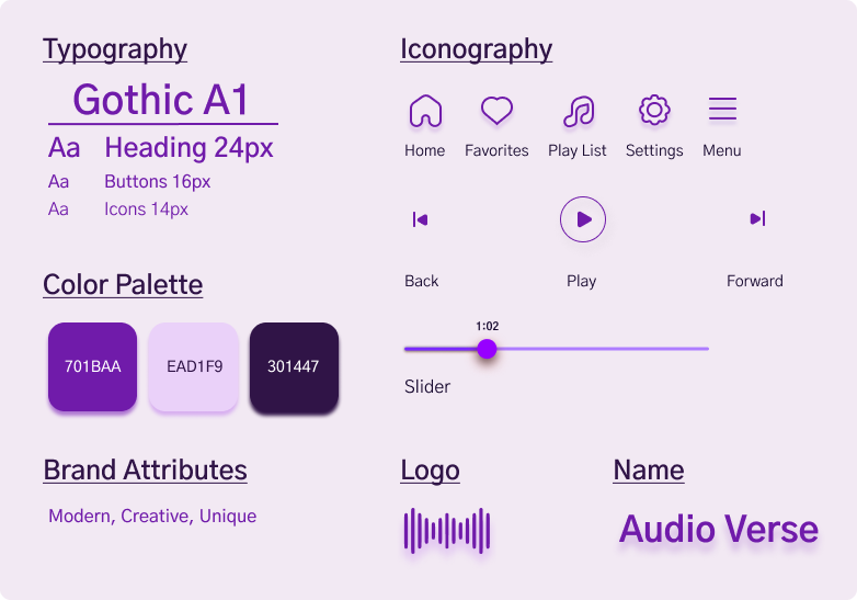
I designed the app's style guide for a creative, contemporary appeal across age groups, balancing youthful lavender with mature royal purple. The name Audio Verse reflects diverse music content, reinforced by a soundwave logo for an engaging auditory experience. Sleek line icons enhance the streamlined aesthetic.
User Interface:
Prototype & Testing
I began with a landing page introducing two new signup flows. The first incentivizes users with a FREE 30-day trial to sign-up for the Premium plan during the account creation process. The second directs users to the Customization screen which appears after account creation, allowing them to select individual services. A banner was added to the existing Guest account home page, featuring a call-to-action for an upgraded plan. Both flows lead to a confirmation page encouraging users to link a payment method with an offer of an additional 30 FREE days. Users also have the option to opt out and proceed to the Home Screen.
Prototype:
Usability Testing:
Testing was conducted with participants ages 19-26, all of whom dedicated considerable time to streaming media. The results indicated that, while users appreciated the customization option, their preference leaned towards the Premium plan. Transparent pricing was a key factor resulting in a higher sign-up rate for the Premium plan perceived as a “better deal.” Additionally the ability to select individual services showed potential to increase overall conversion rates.
Final Screens after Iterating on User Feedback
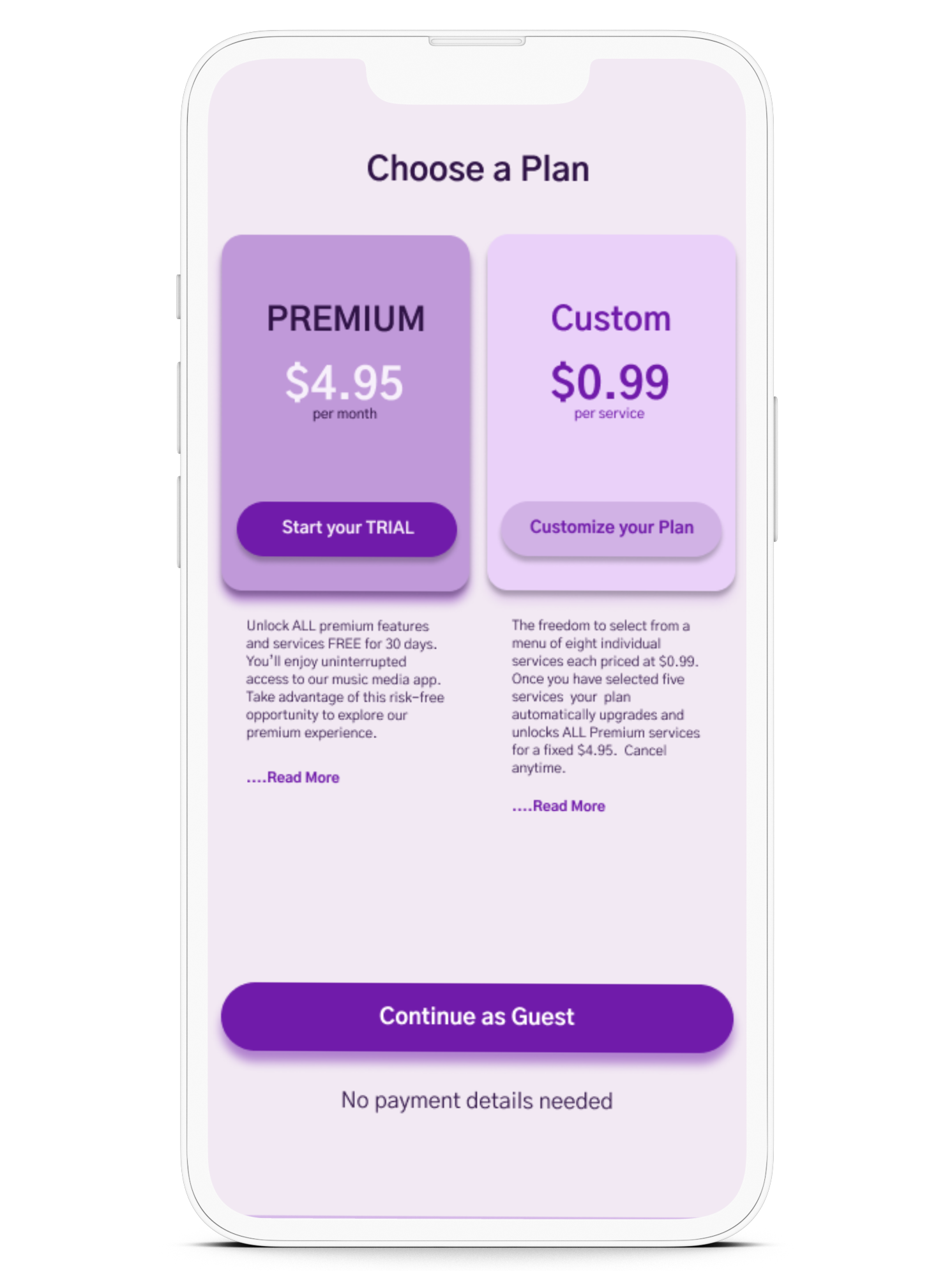
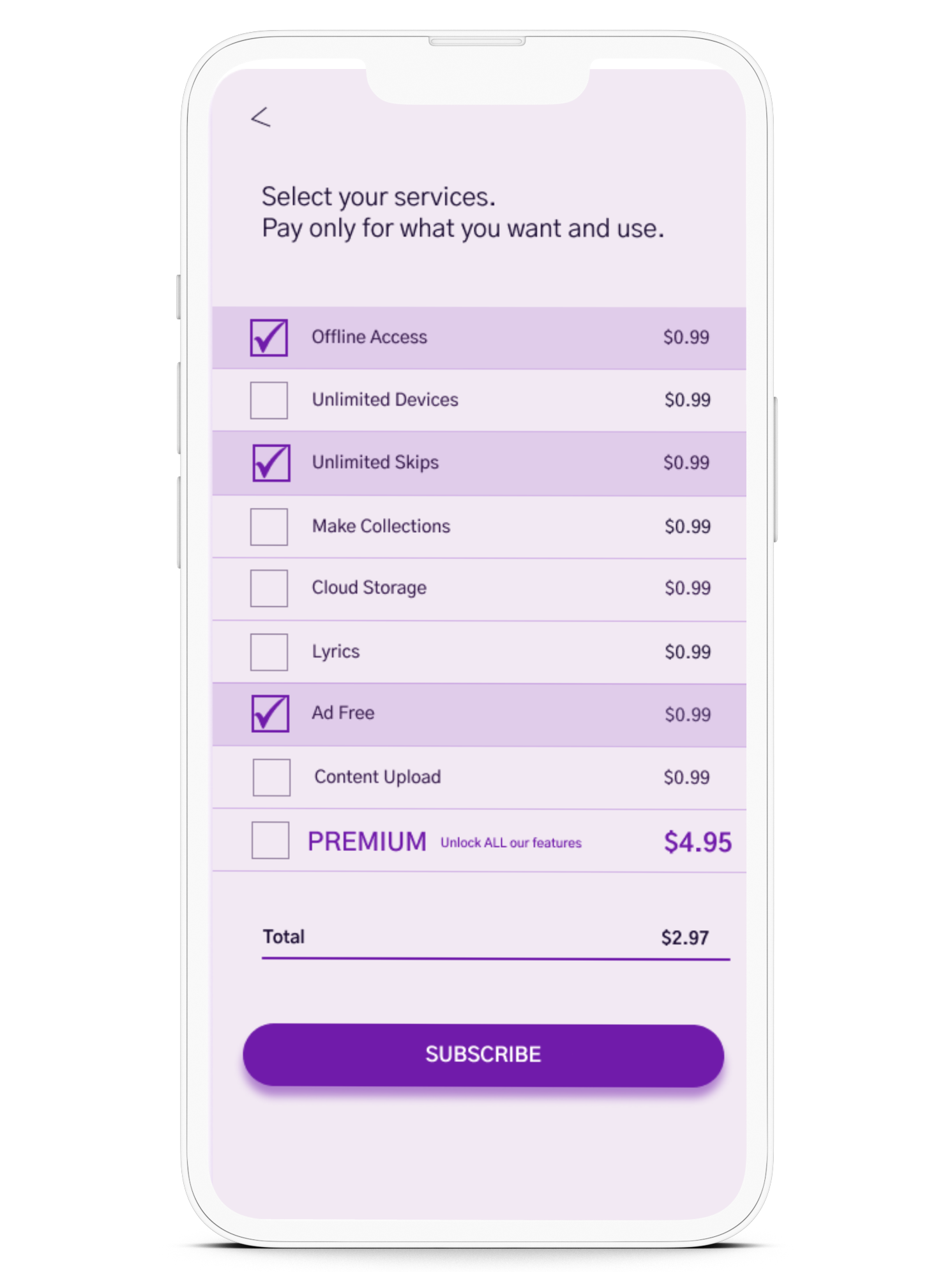


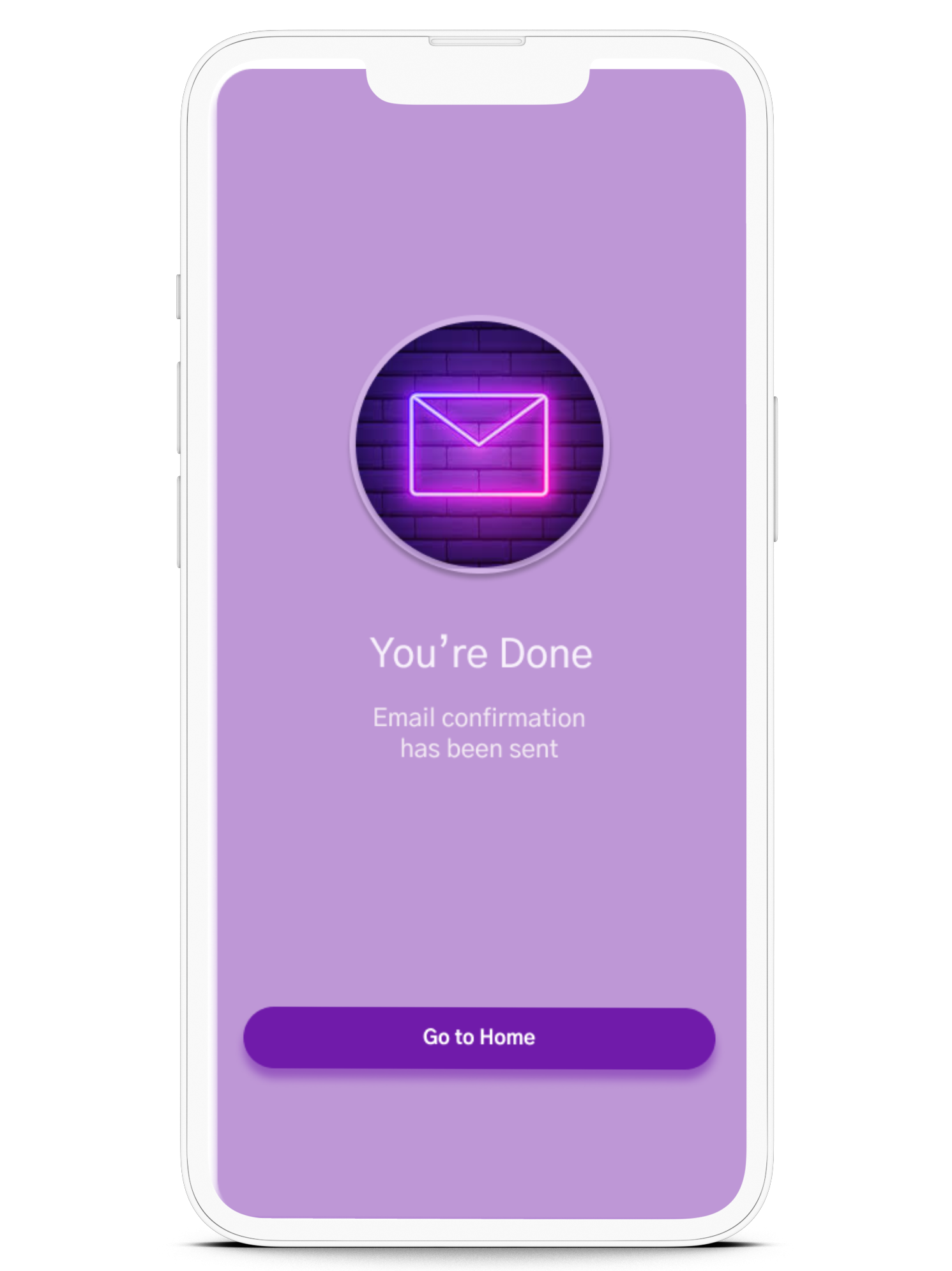

The research and usability testing for Audio Verse yielded valuable insights into user preferences, especially in the free-to-paid conversion process. Key findings highlighted areas for optimization to improve user conversion, engagement and satisfaction. Interface changes effectively guided users through the freemium-to-premium transition. The fixed premium price garnered interest, emphasizing cost-effectiveness and users appreciated the concept of a customized plan.